|

|
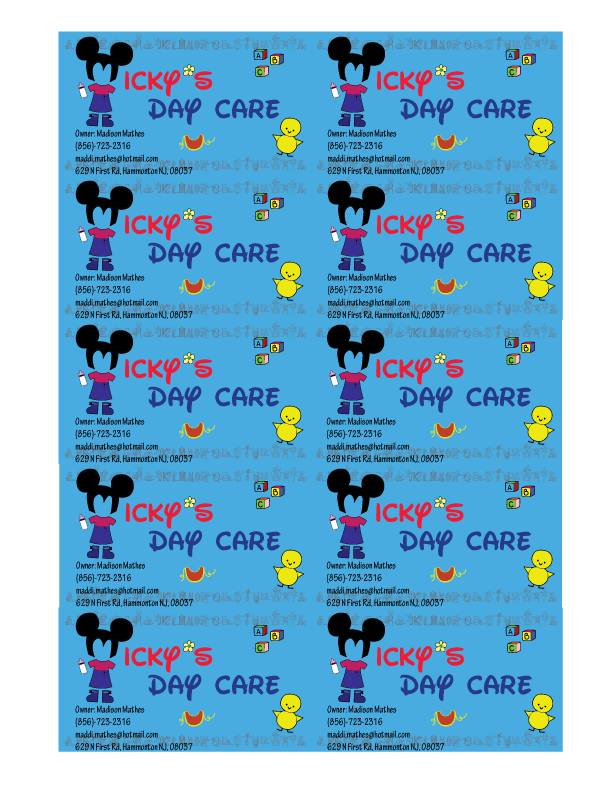
In this project I learned that you have to keep business cards simple but still creative. What makes this logo good is the mickey ears as the "M" for Micky's. I like how the name turned out, it was based off from the Disney lettering. I wish I made the logo better looking. I could of been more creative with everything. I would of give myself an A or B for this project.
